Netflix has rolled out its new user interface, which is intended to offer a more modern and intuitive viewing experience. But despite the best intentions, the changes have been criticized and are causing confusion among viewers. What exactly has Netflix changed and why has the new design met with so much resistance?
- New user interface should be more intuitive
- Users complain about a confusing layout
- Decrease in user-friendliness and performance
- Netflix responds to feedback, but adjustments are still pending
User feedback for Netflix is negative
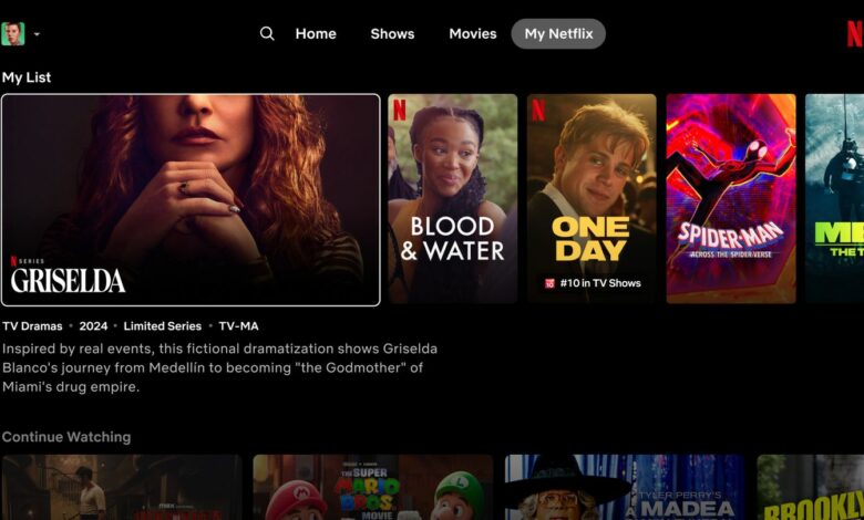
Netflix’s new interface brings with it a number of changes aimed at improving the user experience. These include larger thumbnails, simplified navigation and personalized recommendations, as whats-on-netflix reports. But users are not convinced. Many complain that navigation has become more complicated and the layout seems less clear.
The criticism in a corresponding Reddit forum is primarily directed at the new large thumbnails, which are visually appealing but take up a lot of space and impair clarity. Users report that it takes them longer to find the content they want, which has a negative impact on the viewing experience. Long loading times are also said to impair user-friendliness.
Reasons for the annoyance
There are many reasons why users are annoyed. On the one hand, it is the larger preview images that make navigation difficult. On the other hand, there are technical problems such as longer loading times and occasional crashes of the app. These problems contribute to the fact that the viewing experience is impaired for many users. Another factor is habit. Users who have been using the old interface for years now have to get used to a new structure and operating method.
This change often leads to frustration and rejection. Netflix has responded to the criticism and explained that they are taking the feedback seriously and want to make further adjustments. In a statement, they said: “We are constantly working to provide the best viewing experience and will incorporate our users’ feedback into future updates.”
Conclusion
Netflix’s new user interface has had a difficult start. Despite good intentions and a modern design, it has met with criticism from many users. Clarity and user-friendliness have been impaired by the changes, leading to frustration. Netflix has announced that it will respond to the feedback and make further adjustments. It remains to be seen whether these changes will satisfy users.