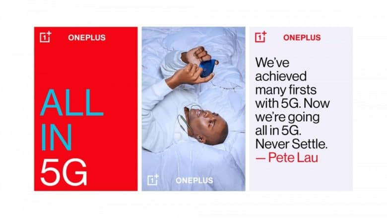
The Chinese smartphone manufacturer has introduced extensive changes to its brand design. The so-called “Brand Visual Identity” consists of logo, colors, slogan, font and brand design. These items have been unchanged for seven years now.
No break with the previous design
Sometimes a revision of the design can bring nasty surprises to light. This does not happen by accident. After all, this is a tightrope walk. One should not break with the old design and, if possible, make sure that it is further developed according to your needs. OnePlus has mastered this task at first sight in its revision. After all, the smartphone expert did not make any too serious changes.
The most important: Logo
A revision of the company logo is always the most serious step. After all, it is the figurehead of the company. OnePlus is also aware of this. For this reason, the manufacturer has made only marginal changes to the logo. At first glance, one hardly notices any difference. This requires a direct comparison with the previous logo.
Obviously, the design team’s goal was to make the logo more legible and striking. Thus, it is noticeable that the iconic 1 in the logo is now more conspicuous. Furthermore, the plus sign now takes up more space in the logo. OnePlus has created the “more” space in the logo by deleting the company name. This no longer appears inside the box, but can be recognized separately. By deleting the name, the logo can now be reduced in size without losing its recognisability.
OnePlus has not changed anything about the tagline “Never Settle”. Only the design of the slogan has been revised. In the future, the slogan will not only consist of upper, but also lower case letters. Furthermore, the two words have been removed from the box. This means that the design no longer looks too boxy.
The font: A new font is used
OnePlus also relies on change in the font. Instead of the previous “OnePlus Slate”, the smartphone manufacturer now uses a completely new font. The aim of OnePlus was to make the font suitable for all existing texts. However, the font shows that OnePlus had to make a compromise. If a font must be suitable for every text, it is never the perfect choice for every single text. Design experts might justly criticise this decision. However, the average user is unlikely to notice it any further.
The colours: OnePlus extends the colour palette
Until now, OnePlus has only used red, black and white. Now a blue-green is being added to the primary colors. In addition to the new colors, other neutral colors may also be used. Certainly, the least change has been in the colors. Whether this change should have been necessary is certainly questionable.
Was the overhaul worthwhile?
Of course, after seven years of company history, it is possible to give the brand a facelift. However, the overhaul sometimes seems like a worsening improvement. For example, it is questionable whether the font really should have been uniform. Furthermore, I think the visualization of the slogan “Never Settle” was better in the original version. But as so often, sooner or later we will have gotten fully used to the new design anyway.


